6.20.2010

No. 443: A Train

No. 442: Appreciate It

No. 441: Respecting the Mail II

No. 440: HELP

There's a place that's not too far, my friends, where the streets are made of licorice lace and the lights emit pools of pink lemonade...

Let's find it...

Please...

6.19.2010

No. 439: Respecting the Mail

No. 438: Summer Gags

No. 437: Where Are You Going, Daddy?

No. 436: Do You Remember?

No. 435: Wait Longer

No. 434: Money and the Monk

No. 433: Day Date

No. 432: Ambitions

No. 431: The Lake

No. 430: Doctor

No. 429: Local Wonders - The Stacked Animals

6.18.2010

No. 428: Cryptic Nonsensical Imagery

Just so you know... I have redesigned the blog. There are now several pages that have large quantities of images to look at. Scrolling endlessly into a void. This is my awkward attempt at trying to make something that is almost like a real website. Let me know if anything is broken. It probably all is.

Also: 
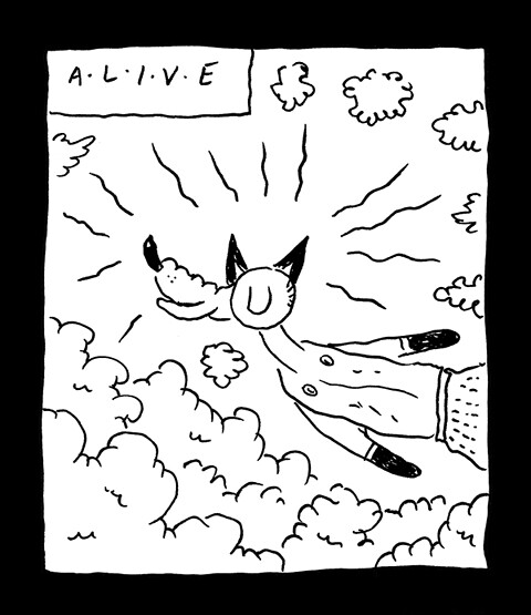
Andrew Smith! Drawings. Great. Sausagehand. Charming person. Look now. I can still appreciate and love Andrew's comics even though there was a terrible person in my high school named Andrew Smith. I want to believe that it is the same Andrew Smith reborn and revitalized.

I've been drawing a lot of comics lately but I don't feel like they can be put on the blog until they are printed. I'm not ready to see them in the computer lights. I might post some doodles and sketchbook pages soon, though.

Until next time, pals of mine!

6.07.2010

No. 427: Vestibule Part III


No. 426: Vestibule Part II


6.06.2010

No. 425: Milt's Visions


Working on various comics and drawings, trying to fill the increasingly suffocating days. Each page of my long Chancellor Cop story is as "good" as I can make it. I take a lot of time on it and try to make it work as a reading experience, more or less. In contrast to that, I am also working on a story called VESTIBULE, which may end up being hundreds of pages if the steam is there. I draw it extremely small, about the size of a quarter-sheet minicomic, and whether or not it is readable to others is not really a concern. Words and pictures are there. I think I'm slowly starting to get to some character stuff, some dialogue, some terrible things happening in the park on a school night. I just finished page 39. Ideally this would be printed as a small 800-page book. COME GET ME, SCHOLASTIC.


Time for a Salt Mines book review. I've been delving into the comic book work of Milt Gross (NOT the person pictured above), and I recommend you do the same. Craig Yoe has released a book of questionable aesthetic quality (what's with the painfully bad font on the spine??) but the content is beautiful and perfect. It's not changing the way I think about comics or anything but each page is so well crafted and flows in just the right way. It's like John Stanley comics that aren't boring. Everyone talks about Gross being wacky and crazy but in many ways it is just the opposite. All of the characters feel "weighted" in a very "right" way, an animation sort of way. It's almost a trick. But it's not an evil or obnoxious trick; it's a beautiful trick. I wish Gross' original art would have been printed in black and white but I'm sure that isn't possible. This "print the old comics as they are" trend isn't for me. I want to see those beautiful upstanding noses (never, EVER down!) as crisply as possible. Look at the way that man draws a dog. Or a duck. Or anything. Yow! Why isn't Milt Gross the talk of the town? This has been a Salt Mines book review.

6.02.2010

No. 424: Margery's Visions